
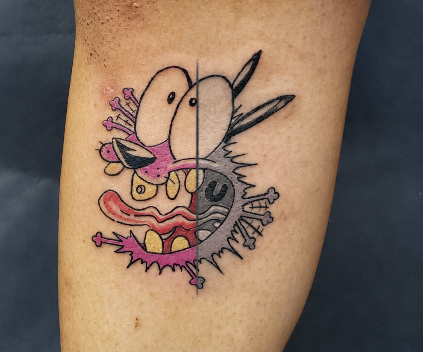
A raven in black & gray can feel quiet, cinematic, and deeply personal. The same bird in saturated jewel tones can feel bold, graphic, and impossible to miss. If you are wondering how to choose between black & gray and color, the answer is not simply which one looks better online. It is which approach best supports the design, your skin, the placement, and the way you want the tattoo to live on your body over time.
Both can be excellent choices. A strong tattoo is not made strong by a color palette alone. It comes from thoughtful design, clear contrast, sound technique, and an artist who understands how the piece will settle and age.
How to Choose Between Black & Gray and Color Tattoos
Start with the feeling you want before choosing a visual category. Black & gray often creates mood through shadows, texture, and restraint. It can make a botanical piece feel like an old field study, an animal portrait feel dramatic, or a fine-line memorial feel understated. Color can create a different kind of impact. It brings energy, symbolism, and visual separation that black ink cannot always provide.
Think about what initially drew you to the idea. Are you responding to a specific flower because of its natural colors? Does an anime-inspired character need a recognizable palette to feel like itself? Does the subject carry a softer, more personal meaning that might be better served by grayscale? These are useful starting points, but they are not rules.
Your existing tattoos matter too. If you are building a collection, consider whether you want the new piece to blend with what you already have or act as a deliberate contrast. A color tattoo can be a focal point among blackwork. A black & gray tattoo can give a busy, colorful collection room to breathe.
Let the subject guide the palette
Some concepts naturally give you more flexibility than others. Animals, skulls, statues, forests, and portraiture can look powerful in black & gray because form, light, and texture are central to the image. Fine-line florals often benefit from grayscale because subtle shading can create depth without making the design feel heavy.
Color may be the better tool when the hue is part of the story. A monarch butterfly, a particular birth flower, a sunset landscape, a koi, or a neo-traditional piece may lose something essential if its color is removed. That does not mean every element needs to be bright. Selective color alongside black and gray can keep a design grounded while directing attention to one meaningful detail.
A good custom design does not force every concept into the same treatment. During a consultation, it is worth discussing the subject in both directions. Sometimes a client arrives certain they want color, then sees how much stronger their idea becomes through value and shading. Other times, a small amount of color is what gives an otherwise familiar image its identity.
Contrast Matters More Than a Trend
The tattoo that looks great in a fresh photo is not always the tattoo that reads best from a few feet away or years later. Whether a piece is black & gray or color, contrast is doing much of the heavy lifting.
Black & gray relies on the relationship between light skin breaks, midtones, and dark blacks. Without enough range, a design can become flat or blurry as it heals and settles. Fine line can be beautiful, but it still needs intentional spacing and hierarchy. Tiny details packed too tightly together rarely improve with time.
Color relies on contrast too. Two hues with similar depth can blend visually, especially in a small design. A skilled artist may use black outlines, darker shadows, or open skin to keep colored elements distinct. Bright color without structure can look soft or muddy once it is healed, while a well-planned color tattoo remains readable because its values are clear.
This is why reference photos should be treated as inspiration, not a blueprint. A design needs to be built for your body, not copied from a flat image that may have been edited, freshly tattooed, or photographed under ideal lighting.
Skin tone is part of the design conversation
Color and black & gray both work across a wide range of skin tones. The question is not whether melanated skin can hold color or grayscale. It can. The more useful question is which pigments, contrast levels, and design choices will create the clearest long-term result on your individual skin.
On deeper skin tones, highly pale pigments may not show with the same brightness they do on very light skin. That does not make color off-limits. Rich reds, oranges, greens, blues, and deeper jewel tones can be effective when selected thoughtfully. Black and gray can also create beautiful depth, but the artist must plan values with the client’s natural complexion in mind rather than relying on subtle gray washes that may not read clearly enough.
An honest artist will not promise that every reference photo will translate exactly the same way on every person. They should be able to explain what will likely show, where stronger contrast is needed, and what design adjustments will protect the tattoo’s readability. The goal is not to imitate somebody else’s result. It is to create the best version of the idea for you.
Placement Can Change the Right Answer
A tattoo’s location affects visibility, sun exposure, how the skin moves, and how much room the design has to develop. These factors can influence the black & gray versus color decision.
Color often benefits from enough space to show transitions and separation between hues. A small color tattoo can work, but the design should stay simple and graphic. If you want a detailed landscape with several colors, a larger placement such as the thigh, upper arm, calf, or back will usually offer more room for it to breathe.
Black & gray can be more forgiving for certain small-scale designs, particularly if the idea depends on linework and a limited amount of shading. Still, small does not mean limitless. A highly detailed animal portrait on a finger or a dense bouquet compressed into a few inches will lose clarity regardless of palette.
Sun exposure deserves a practical mention. Tattoos on hands, forearms, shoulders, and feet often receive more sun and friction than tattoos in more protected areas. UV exposure affects all tattoos, though some colors can show fading more visibly over time. Consistent sunscreen after healing and realistic expectations about touch-ups are part of choosing any exposed placement.
Consider Aging Without Letting Fear Make the Decision
Black & gray has a reputation for aging well, and there is truth in that. Strong black values and good spacing tend to hold up beautifully. But “black & gray ages better” is too broad to be useful. Poorly designed black & gray work can fade into a soft, unreadable shape, just as poorly planned color can lose distinction.
Quality color tattoos can age very well when the artist uses appropriate saturation, clear value structure, and enough room between details. They may mellow over time rather than stay as bright as the day they were done. That is normal. Black & gray also changes, with grays softening and contrast evolving as the tattoo settles into the skin.
The best way to plan for aging is not to avoid color automatically. It is to avoid choices that depend on extremely tiny detail, barely visible contrast, or trend-driven styling that does not actually fit your idea. Choose a design you will still recognize and care about when the tattoo has softened into a lived-in part of you.
Bring References, Then Make Room for Collaboration
Save examples that show the mood, composition, level of detail, and palette you are drawn to. It helps to include examples of what you do not want as well. Instead of asking an artist to copy one image exactly, explain what is working for you in each reference: the deep shadows, the limited red accent, the soft botanical linework, or the bold neo-traditional outline.
The design conversation is meant to make the choice clearer, not pressure you into a style. A consultation can reveal that the answer is black & gray with one color accent, a muted palette rather than full saturation, or a color concept simplified for better longevity.
Give yourself permission to choose the version that feels most honest when you picture it healed, moving with your body, and still there years from now. That is usually where the right palette starts.